An analysis result looks like this:
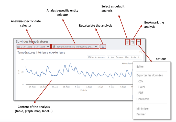

At the top right, the button in the shape of a cup allows you to choose the analysis that will be opened by default on connection. This choice is specific to each user and will be saved in their user preferences. (This choice can also be preconfigured by the database administrator).
The small star allows you to bookmark the analysis, so that you can find it easily. The button with the 3 small dots gives access to several options such as exporting the results of the analysis in various formats (csv, excel, pdf), editing the analysis definition, generating a kiosk link, minimising or closing the analysis.
In the options, the "Edit" button is obviously only accessible to users with editing rights for the type of analysis displayed, and will send to the widget or dashboard editing interface.
The "Kiosk Link" option allows you to generate a direct URL link to the dashboard from outside METRON ENERGY MANAGEMENT (JOOL).
Each analysis also has a specific date selector and entity selector, allowing METRON ENERGY MANAGEMENT (JOOL) to display multiple analyses on different time contexts and channel selections simultaneously.
The date selector is exactly the same as the global context selector, but it only affects the current analysis.
The entity selector allows you to choose/modify the list of entities on which the analysis will focus. A change of selection via this selector will also only impact the current analysis.
A. Local entity selector
In METRON ENERGY MANAGEMENT (JOOL), each analysis can have its own selection through a specific entity selector.
Remember, using the general tree (or favourite entities) at the bottom left of the METRON ENERGY MANAGEMENT (JOOL) window to change the global selection will change the selections of all the scans displayed (minimised scans are not affected).
As a reminder, a single click on the global entity selector will replace the selections of each displayed analysis with the chosen entity, whereas a double-click will simply add the entity to the current selections.
The entity selector specific to the analyses is in the following form:
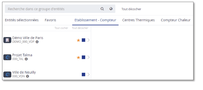
It contains a search field to find an entity . 
The magnifying glass will search the currently displayed view ,and the small planet will search the entire data base of existing entities/counters.
The general "Uncheck All" button at the top allows you to clear the current selection of entities at once.
Below this search field is a menu bar listing all available views. These views are used to sort the entities/counters in order to be able to find them easily to make a selection. In addition to the available views, there are also fixed lists, which are useful for making up a selection.
-
Selected items: the list of currently selected entities, for a quick summary, and possibly to easily remove entities from the selection.
-
Favourites: the list of the logged-in user's favourite entities.
-
Views: each additional list is a pre-configured view to which the logged-in user has access. These are the same views as those available in the global entity selector at the bottom left of the METRON ENERGY MANAGEMENT (JOOL) window.
Below this banner of views is the chosen view, organised in columns. Each entity is represented by a small block containing its icon, name and reference as well as several buttons.
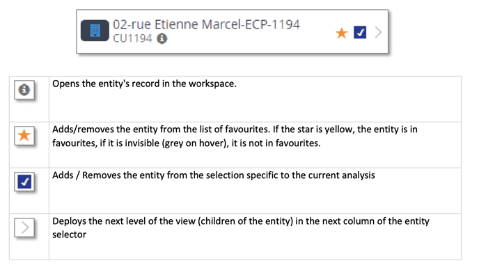
When you expand the next levels of the view, you get several columns in the selector. The entity in the left-hand column which has been expanded is grayed out for greater visibility, and in the next column, we see its children (in the active view, not necessarily its children in the sense of the real tree structure).
Each column also has "Check All" and "Uncheck All" buttons to select all entities in that column at once or to remove them from the active selection.
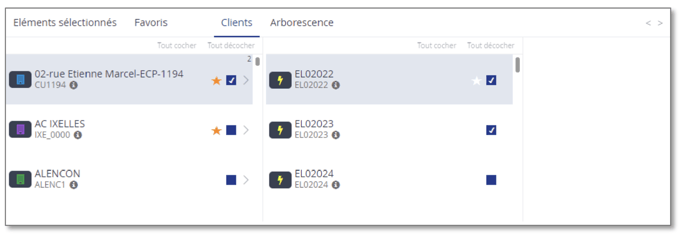
Note: deploying a 2nd entity will replace the children of the first entity by those of the new one. It is therefore not possible to display the children of several entities at the same time.
In order not to lose track of the entities already selected, even if they are checked in non-deployed sub- views, a small number appears at the top right of each entity for which sub-entities have been selected.
In the example above, the small "2" at the top right of the first site's box indicates that there are 2 subentities checked in the descendants of this entity, in this case EL02022 and EL02023.
C. Display of tools
Whether a single widget is displayed or a dashboard containing several, each widget can be manipulated by the user according to its type. For example, it will be possible to sort the columns of a widget displaying a table or zoom in on a widget displaying a graph.
Graphics
The graphs in JOOL are presented in the following frame:
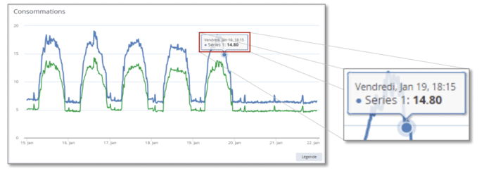
On mouse-over over the curves, a tooltip indicates the point information (date, value).
Legends
The "Legend" button at the bottom right allows you to display/hide a legend area.
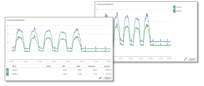

The buttons with two arrows allow you to move the legend from one location to another, either at the bottom or on the right of the graph. The legend at the bottom shows the names of each series and some useful information, such as the unit, minimum and maximum of that series, the average and the sum. On the right-hand side, it keeps only the series names.
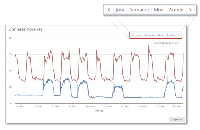
Fixed periods
On the display area of a graph, you can see an area listing time periods. Clicking on a "Day" period will cause the graph to display one day only. The "<" and ">" buttons are then used to move to the previous or next day.
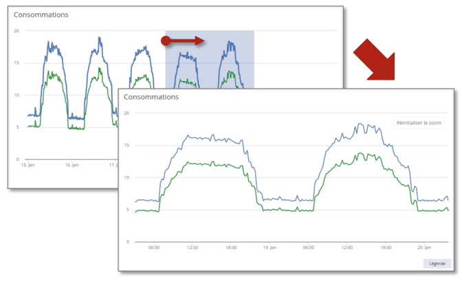
Zoom
It is also possible to zoom in on the graph. To do this, hold down the left mouse button and stretch an area to zoom in on. Once a graph has been zoomed, a "Reset Zoom" button appears to allow you to return to the initial graph.
Types of graphs
Each series in a graph can be configured by a METRON ENERGY MANAGEMENT (JOOL) administrator to be displayed with a chosen colour, and shape.
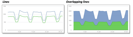
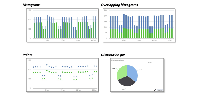
A graph can of course have a histogram series and a line series.
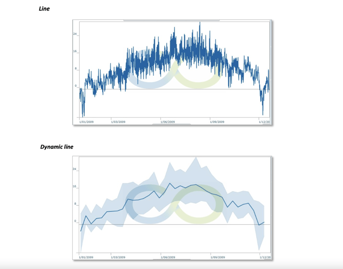
Dynamic line
In some cases, the data is very large and not necessarily readable as is. For example, if you display the 10- minute data of a 10-year counter, you will get a very large amount of data, resulting in a blurred area where the dots overlap.
In this kind of situation, the information does not come from the value of each individual piece of data but rather from the evolution of the average of the data and possibly their spread. The "Dynamic Line" type was created for this purpose. The dynamic line aggregates the data over a time step (automatically calculated according to the size of the graph to be displayed) and displays the evolution of the average, and METRON ENERGY MANAGEMENT (JOOL) also displays a brighter area, to materialise the range in which the actual values are included.
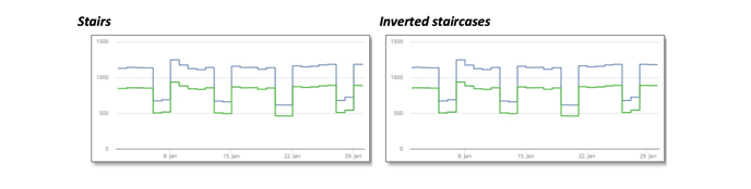
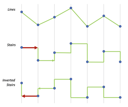
Stairs or inverted stairs
The staircase or inverted staircase display is designed in a similar way. METRON ENERGY MANAGEMENT (JOOL) takes the list of points to be displayed, and draws a horizontal line from each point to the next.
-
The staircase display stretches the value horizontally to the right. This case is, for example, used for properties, where a value at a given time is considered valid until it is replaced by a new value later.
-
The inverted staircase display stretches it to the left. This case is used for consumptions, where a consumption over a time interval is measured at the end of the interval but therefore represents the consumption over the past time interval.
Labels
Based on the Energy Label principle, these displays can show value class

es and related sliders.
These labels are fully configurable by METRON ENERGYMANAGEMENT (JOOL) administrators, both in terms of class definitions and cursor value
calculations, as well as the colours associated with each class.
Forms
The forms are HTML pages, generated by METRON ENERGY MANAGEMENT (JOOL), which can be sent via URL links by email to allow external users to enter meter reading values into METRON ENERGY MANAGEMENT (JOOL).
The general appearance of the form (mainly the header of the counters) can be adapted to some extent by METRON ENERGY MANAGEMENT (JOOL) administrators.
Circular gauges / Performance gauges
Presented as speedometers, these gauges (2 different
graphic types) allow an intuitive visualisation of certain values in relation to a range of normal operating values.
Again, the colours, terminals and display value are configurable by METRON ENERGY MANAGEMENT (JOOL) administrators.
Thermometer gauges
Presented as thermometers, these gauges allow intuitive visualisation of certain values in relation to a range of normal operating values.
The configuration is similar to the circular gauges and is under the control of the METRON ENERGY MANAGEMENT (JOOL) administrators.
Cards
METRON ENERGY MANAGEMENT (JOOL) can also be used to display a selection of channels on a geographical map, to visualise the progress of an installation project for example, or to quickly check the status of certain parameters deemed relevant by the client.
Points can be positioned on the map by assigning a colour, size and shape.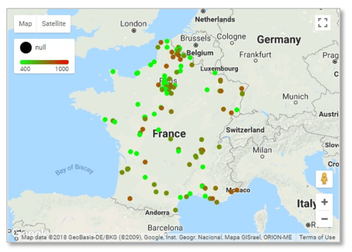
Generally, colour is used to represent a qualitative value (performance of a site, progress of a project...) whereas size is generally associated with a quantitative value (total consumption, surface of the site, number of inhabitants...).
The form can be used to identify the type of site for example.
When hovering, a tooltip displays certain characteristics of the site, chosen by the METRON ENERGY MANAGEMENT (JOOL) administrators.
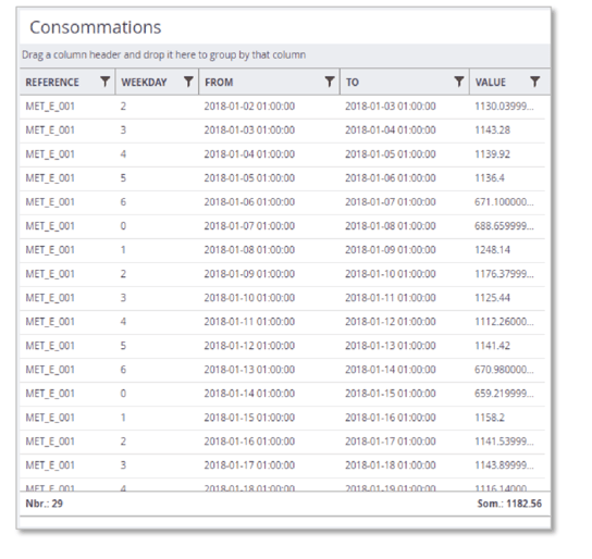
Data tables (grids)
METRON ENERGY MANAGEMENT (JOOL) can also be used to display tables of data directly. These tables can come from static data stored in the database, or from spreadsheets based on consumption data for example.
A table is presented in the following form:
-
At the bottom of the table, we can see an aggregation row, containing the aggregated values of the columns for which this has been configured. In the example above, the REFERENCE column is aggregated into a count, which allows us to see that there are 29 rows in the table, and the VALUE column is aggregated into a sum, which shows us that the total consumption for the observed period is 1182.56.
-
By dragging and dropping the title of each column, it can be moved to rearrange the order of the columns.
-
Clicking on a column header will apply a sort to that column. A further click will force the sorting to be reversed, and a third click will remove the sorting.
-
The small symbol to the right of each column heading allows you to apply a filter to display only rows with certain values.
-
Finally, a drag & drop of a column heading in the area just above the headings will group the rows of the table based on the value of the chosen column. It is possible to perform several successive groupings. For example, we would have a table with the consumptions of all the meters of a site, and this table would contain a column indicating the resource measured by the meter. Grouping according to this column will result in all the electricity meters being grouped in one section, then all the gas meters and so on.
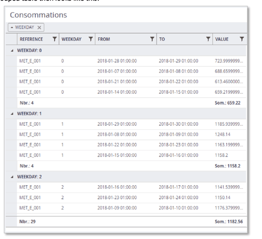
We have grouped the rows here according to the "WEEKDAY" column, so we have a group of rows per value in this column, and for each group, we find all the rows associated with it, as well as a partial aggregation row carrying out the counts on the group only. The global aggregation line is always found at the very bottom of the table.
In addition to the classic values (numeric, text, date, etc.), the grids can also contain dynamic links to other types of objects (dashboards, invoice sheets, entity sheets, etc.) as well as action buttons allowing, for example, the generation of a credit note from an existing invoice.
Matrix graphs / Thermographs
Matrix graphs, or thermographs, are two- dimensional graphs that allow a value to be viewed at a glance over a given period of time.
This graph places the hours of the day in X and the days of the given period (via the time context) in Y and displays the value to be observed in the graph in a colour gradient.
This kind of graph allows you to spot at a glance any anomalies in the consumption of a meter, for example.
In the graph above given as an example, we can see that 2 days per week have a much lower consumption than the other days. We can also see that consumption is concentrated between 6am and 8pm for an open day.
HTML / URL links
METRON ENERGY MANAGEMENT (JOOL) widgets also allow you to insert HTML code directly into a dashboard.
For this purpose, the "HTML" widget can be given HTML code "augmented" with METRON ENERGY MANAGEMENT (JOOL) code (to embed dynamically calculated values), with all the layouts that HTML allows. How to develop such reports is well beyond the scope of this presentation manual, and will be covered in the manuals for more advanced users.
This widget can also be given a URL to redirect to an external site, allowing a thumbnail from another site to be inserted into a METRON ENERGY MANAGEMENT (JOOL) dashboard. For example, a local weather site could be used as a METRON ENERGY MANAGEMENT (JOOL) widget, or real-time traffic information.
Images
In order to personalise the dashboards and reports for each client, it is sometimes useful to be able to integrate a logo, a banner in the company's colours or even a simple still image for illustration. This is possible via the "Image" widgets.
Text box
In the same way, it is also possible to insert in a report or a dashboard, a text zone to note comments, explanations, or any other text that it would be relevant to display.
For this purpose, the "Text box" widget allows you to write and format a text that will be included in the final report.