The bar chart allows you to rank several variables in a unique widget. It is particularly useful to compare and benchmark KPIs of multiple perimeters.

Main widget options
The following main options are available for the Bar chart:
- Main: you can set the title of the widget and the time range
- Options: you can select horizontal or vertical bars and enable the ranking to rank the variables from the highest to the lowest

Widget configuration
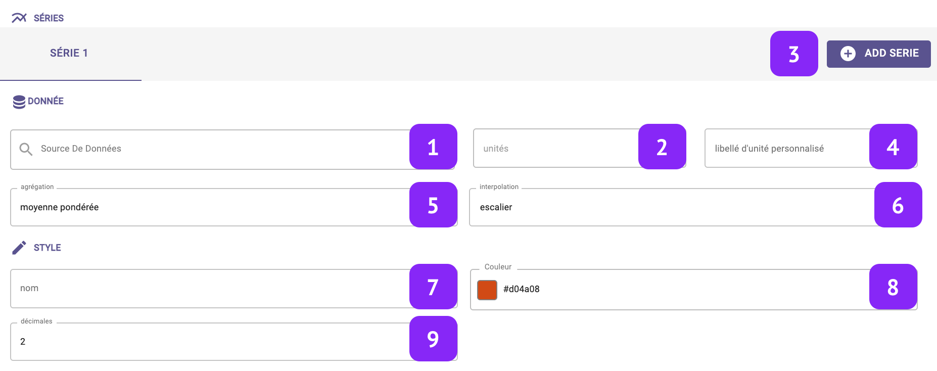
- Data Source: select which variable you want to plot.
- Units: Select the unit of measure, among the list of units associated to that variable (for instance:°C, °F, K for temperature).
- Add serie: This option will create an additional column in your graph to display another variable.
- Custom unit: Set a custom unit of measure: you can change manually the unit of measure.
- Aggregation: Set the aggregation to decide how to aggregate the available raw points over the selected granularity. The following aggregations are available: min, max, count, difference, first, last, mean, weighted mean, sum, mode, none. Notice that, in case “none” is selected, the selection of the granularity at widget level is not relevant anymore.
- Interpolation: Set the interpolation between points.
- Name: Associate a “label” to the series, to be visualized in the widget “legend” and series tab.
- Colour: Set a specific color to display your variable.
- Decimals: Set the number of decimal places.