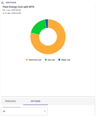
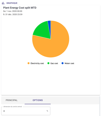
The pie chart is typically used to show repartitions, for instance to represent where the energy is consumed.
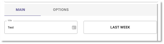
Main widget options
The following widget options are available for the pie chart:
- Main: you can set the title of the widget and the time range
- Options: you can set the inner size of the pie chart
Widget configuration
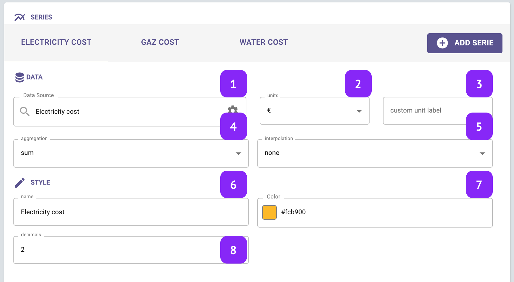
- Data Source: select which variable you want to plot
- Units: Select the unit of measure, among the list of units associated to that variable (for instance: °C, °F, K for temperature)
- Custom unit: manually change and set a custom unit of measure.
- Aggregation: Set the aggregation to decide how to aggregate the available raw points over the selected granularity. The following aggregations are available: min, max, count, difference, first, last, mean, weighted mean, sum, mode, none.
- Note that in case “none” is selected, the selection of the granularity at widget level is not relevant anymore.
- Interpolation: Set the interpolation between points
- Name: name your series, this name will be displayed in the widget legend and series tab.
- Color: Change series color
- Decimals: Set the number of decimal places