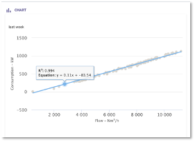
The scatterplot allows the user to show correlations between one variable in x-axis and another one in y-axis.

Main widget options
The following main options are available for the Scatterplot:
- Main: you can set the title of the widget, the time range and the granularity.

- Options: You can select minimum and maximum values for the axes and you can enable the regression line. The platform shows the correlation score (R²) and its equation.
Widget configuration
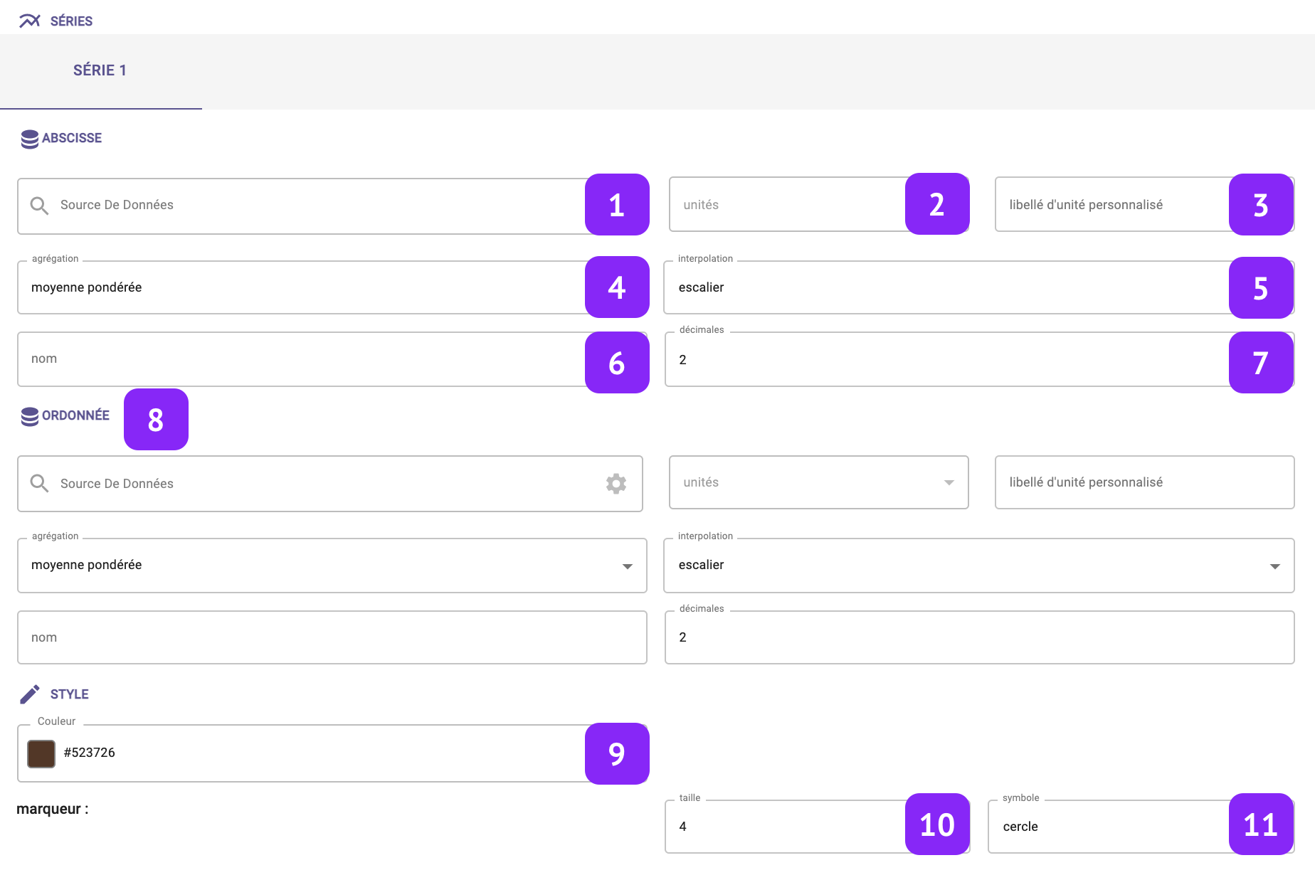
- Data Source: select which variable you want to plot.
- Units: Select the unit of measure, among the list of units associated to that variable (for instance:°C, °F, K for temperature).
- Custom unit: Set a custom unit of measure: you can change manually the unit of measure.
- Aggregation: Set the aggregation to decide how to aggregate the available raw points over the selected granularity. The following aggregations are available: min, max, count, difference, first, last, mean, weighted mean, sum, mode, none. Notice that, in case “none” is selected, the selection of the granularity at widget level is not relevant anymore.
- Interpolation: Set the interpolation between points.
- Name: Associate a “label” to the series, to be visualized in the widget “legend” and series tab.
- Series type: Decide whether the axis chart should be a line, a bar, or an area.
- Same options for the y-axis
- Color: Change series color.
- Radius: Change the size of the marker
- Symbol: Change the shape of the marker
The following main options are available for the Scatterplot:
You have to select at least two variables (x-axis and y-axis) to validate the scatterplot.