The table widget allows you to visualize your variables values in a table and have a detailed view of your data. This widget is also recommended if you want to download your data in a csv file.
The first column gives the values timestamp, the other columns correspond to the variables added into the widget.

Main widget options
In the main options of the counter, you can set the title of the widget, the time range and the table granularity (1 row per day, per hour, etc.)

Widget configuration
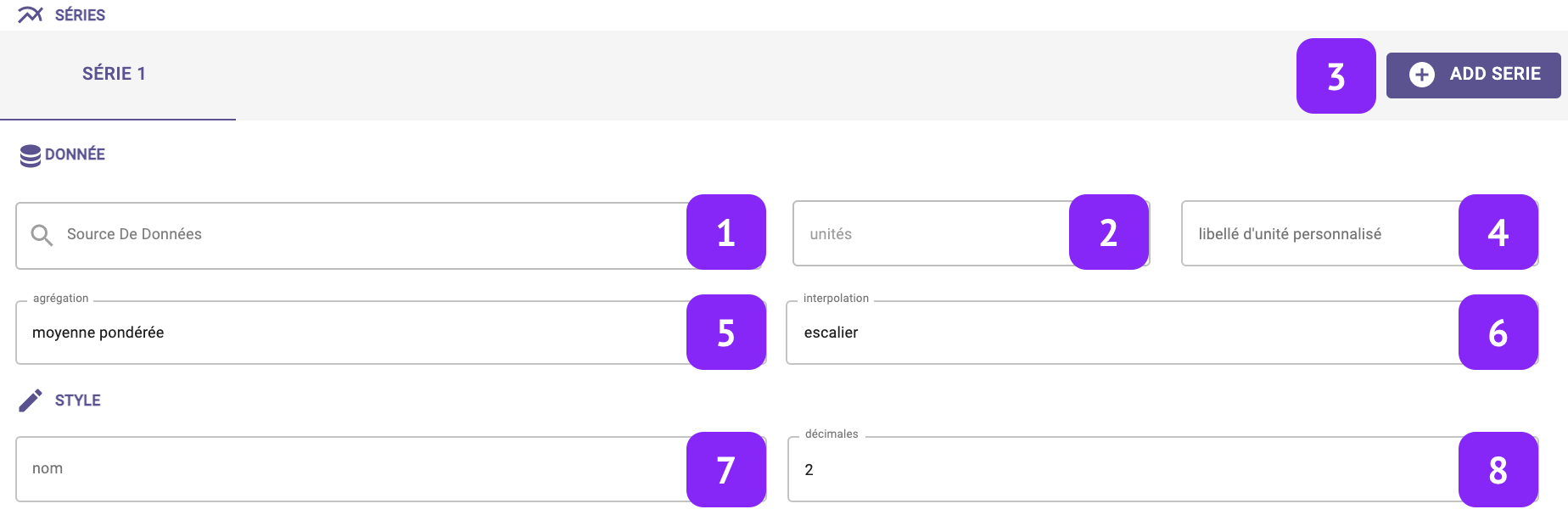
- Data Source: select which variable you want to plot.
- Units: Select the unit of measure, among the list of units associated to that variable (for instance:°C, °F, K for temperature).
- Add serie: This option will create an additional column in your table to display another variable
- Custom unit: Set a custom unit of measure: you can change manually the unit of measure.
- Aggregation: Set the aggregation to decide how to aggregate the available raw points over the selected granularity. The following aggregations are available: min, max, count, difference, first, last, mean, weighted mean, sum, mode, none. Notice that, in case “none” is selected, the selection of the granularity at widget level is not relevant anymore.
- Interpolation: Set the interpolation between points.
- Name: Associate a “label” to the series, to be visualized in the widget “legend” and series tab.
- Decimals: Set the number of decimal places.